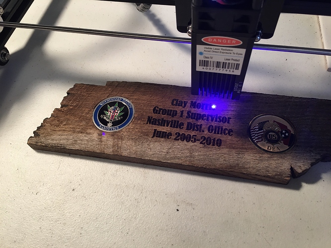
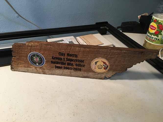
Just finished this up for a friend. 1200/15 fill only and did it twice. Found out fill line took away from the small details on 0’s etc.
The starkness of the contrast is impressive.
Your only “trick” was doing two passes?
It really looks great. Congratulations!!
Yes sir two passes Fill only. Big thing is the Fill/Line really took detail away from the final product. This was much sharper. Line interval at .085 helped as well.
Interesting that fill/line took detail away from the lettering. My experience using the 40W laser was just the opposite because the outline(line) process was what really crisped up the lettering.
I wonder if it has anything to do with a diode laser burn point not being round but instead is oval as opposed to a CO2 laser which makes a round point.
Doug I would say you hit it on the head about the diode. Be interesting to test it this evening where instead of the fill/line and line power setting are the same, change it to where the Line power is a little lower for that burn.
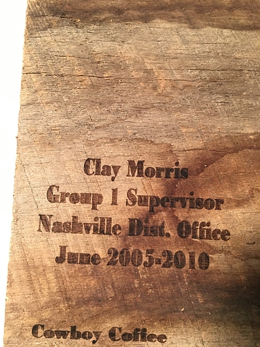
This was the fill/line test and you can see the closed in spots
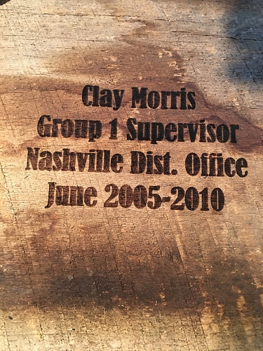
This was without Line (same settings) on the same board.
tough to tell since you used different fonts and it looks like different power settings. the fill/line pic has the fill much lighter than the one said to be just fill.
Maybe look at the simulation in Lightburn to see if there’s some offset being applied to the outline operation. There should not be any offset and that’s what really cleans up the horizontal lines at the edges. Atleast on my CO2 laser.
thx I’ll check out the offset…first I’ve heard of it. Doing test now. The font has not changed at all. the darker burn just made it look thicker.
I just looked and the size went up some but not by much. making the S look stubby it seems
Things like the Y just look way different when one is a short top section and the lower has the sections meeting down low. Makes it look like completely different fonts. interesting.
Doug it’s not in my notes as to that so to be honest with myself, and the fact that I’ve been testing this so much I shouldn’t really say that that was or was not the same font size. I’m glad you noticed that because that tells me I need to start taking better notes LOL


